


Adam Feller: Telling Your Story Through Packaging

Adam Feller is the creative director and owner of Avidity Creative, a branding and design company specializing in the food and beverage CPG industry. He brings over a decade of creative experience and an outsider’s perspective to helping more than fifty food and beverage brands reach their potential on the shelf.
Adam joined me to discuss how brands can tell their story visually, and we ended up focusing on photography, illustration, and color in this conversation. But it’s not just about choosing a pretty palette – it’s about business strategy.
Read our conversation below, or click to listen in:
Anna:
Hi Adam. Thank you so much for joining me today.
Adam:
Thanks Anna. I’m excited to be on the show and I’m excited to talk about some branding, design and the strategy that goes with it.
Anna:
Same. So often we think of branding as a set of deliverables, a logo and things like that. But branding’s a lot more than that.
So how does visual branding help companies tell their stories?
Adam:
Yeah, of course. So just to give us some background, at Avidity Creative we focus on the packaged food and beverage industry, so we do a lot more than just logos and design.
Talking about the strategy side of things, when it comes to how your visuals tell that brand story, the majority of people I would say are probably visual learners. And then when it comes to things like your marketing, you’re not always gonna get an opportunity to have text in front of someone or audio in front of someone, like a radio ad or something. Sometimes you need to get a message across quicker than you can with text or audio. So those visuals help tell that story in that way, make a deeper connection with those customers. Most of the stuff that we work on or put a lot of strategy into is packaging.
When a customer is in an aisle, they’re at a grocery store, they’re getting bombarded with messages by your competitor’s packaging that’s all around you. Right? So trying to get this visual story across, very quickly and very concisely, it’s hard to do with text.
Even a matter of one sentence could be too long, lots of times. Outside of things like packaging, you have promotional signage, you know, if it’s at a, at a grocery store or retail or if it’s at a trade show or something. Being able to, again, just get the message across quicker. So having your visuals being able to help tell that story, can make not only a deeper impact, but a quicker impact with that customer.
>
“ You’re not always gonna get an opportunity to have text in front of someone… So visuals help tell that story… make a deeper connection with those customers.”
Anna:
Okay. Can you give an example of how something that you would create as part of a visual brand conveys a story without any text at all. Because to me, when I think story, I think words, so, how can you do that without words?
Adam:
Yeah, of course. That makes a ton of sense. And it’s pretty natural to think of things that way. I would probably think that way also. Your photography, your brand photography, using photos to show, you know, typically you see this like lifestyle photos.
I see it in use probably most often when it comes to either your social media posts, your website, your sales sheet, and then coming back to trade shows again. I’ve seen ’em in either pop-up banners or backdrops, using a photo to show your product in use the way that it’s intended to be used, is a great way to tell that story.
And you can also incorporate your brand into in the photo, like it could be a matter of who’s the person using the product. Is it male, female? What’s their age? How are they dressed? Are they dressed? They’re probably gonna be dressed in an appropriate setting that your product is used.
I know we, if we focus on food and beverage stuff, you wanna show a protein shake type of product, you’re probably gonna have an image of someone who’s just finished a workout, maybe they’re sweating, they’re telling that story. And obviously there’s the setting that comes along with that too.
But, you can show that the product is quick and easy to make. You know, maybe it’s a protein that’s in a little packet that you just pour into your bottle or shaker that already has your milk or your water in it. Then they shook it up and it’s right there so there’s so using photography in that way, it can also help educate.
I suppose coming back to how it tells us your brand story, it depends on what your exact story is. It’s hard to get very, very specific, but that’s probably a great example in general of how you can use imagery or visuals to tell that brand story. Other times it’ll come along in things like illustrations, you know, if there’s icons you need to, I suppose we use it a lot more when it comes to educating a customer.
About a product. If it’s something that’s new to the market, you know then there’s gonna typically be some education along with it and like, why is this product good for you? Sometimes it’s harder than others to get that story accurate in visuals, but using things like illustration work, shows your brand style, your visual design, brand style, along with telling that story of the product.
Anna:
I love that. I’ve worked with a lot of clients where they have better for you products or really innovative products using ingredients that are less familiar to the average consumer in their market here in the US. And it’s tough to figure out how to provide a lot of education about what the ingredients are, what their benefits are, and how people are meant to enjoy the product in a really concise way. So bringing visuals into it can definitely help.
Adam:
Yes, of course.
Anna:
I love what you said about showing pictures of products and use. I had a conversation which is part of the series with Monica Farber, who’s a photographer, and she gave some examples of her clients and the kind of photos and videos she creates, which are just really snippets of a product and use.
Like a handbag that someone is carrying or a cocktail that someone is mixing.
Adam:
When you wanna show the versatility of a product, I know a lot of that’s kind of a big thing with a lot of our clients, or it seems like new clients are coming to us. They wanna tell us that their product can do everything. They make a sauce that can go on everything, right? Which sometimes we’ll try to reign that back in. But that’s another topic. But if you wanna show versatility, you can show the same products surrounded by the different ways that it could be used.
So if it is a sauce, using photography or video even. A lot of times you might have audio that’s included with that. But if we’re just talking about the visual side of things, eing able to show that product in those different uses, you can sometimes do it in a very quick way.
If it’s one social media post, maybe it’s a grid and the product is in the center, but you have almost like a cropped part of the photo that’s from each of these different settings or something. same thing with video. It’s just done in quick cuts, right? So there’s lots of different ways to do it visually, and in our opinion we love to have the text involved, so working with copywriters like you and stuff, but if we’re trying to show something very quick, you know, sometimes leaving text visually off of the creative piece, it can actually speed things up a bit.
>
“Brands are fluid, just like everything else these days. So be willing to adapt and change what you’re doing and how you’re interacting with your customers.”
Anna:
Business owners, as we all have our own businesses, we become so close to our products and so close to the stories that we’re telling, that sometimes it’s hard to know if people who are new to the brand are really getting the right message. So how do you know if the message you’re putting out there and the visuals that you’ve created for your brand are actually connecting with your target customer?
Adam:
Probably the easiest answer I could say is to collect data and look at how have your sales been impacted when you either tweaked a message or changed a message message, and maybe give it some time, of course. What we always, always recommend clients to do is send out surveys, you know, whether it’s in-person surveys at, you know, food tastings or trade shows, things like that.
Or you can email blast. Send out a survey to your actual customers. If you sell your product online, you likely have an email subscriber list of people who actually bought product from you. and you can ask those questions of, what are the first things that come to mind when you think of ABC brand name?
Those responses, you should be able to determine from that. Does it align with what you are trying to portray, what you know, that story that you’re trying to get out. That’s probably the easiest way, or at least the most accurate way. Other things are you talk to people, you can compare how your competitors, what their messaging is like.
You can, if you’re watching your competitor’s social media and their websites and see how things are portrayed on that, and then compare it to your own story. And of course when it comes to how is that connecting or how’s the messaging connecting with the right people, uh, or your, uh, your customers?
Like is it connecting with your customers? I would say most people probably have before they’ve started a campaign or before they started their business, there’s some speculation on who their target audience. So you’ve probably gone through making a customer persona, or just having some sort of general expectations of who the people are that’s gonna buy your product.
And in most cases when you start out, you’ve formulated a message to appeal to that person. So then on the back end, give it some time, six months to a year, and you do some of that data collection afterwards, then you can go back and look, are the people that we’re trying to reach, the people that we speculated when we started out is that actually who we’re reaching now. So those are, those are ways I would say, like, I always try to get as scientific with it as we can to get like true actual representation. But then just looking at that data and, and kind of formulating your new message going forward after that to correct the story.
And it depends on the situation, on whether you want to change that message because you want to have a different target customer, or do you change your message to impact deeper with that customer that you are already reaching, whether it’s unintended or not.
>
“Connect with your customers as frequently as possible…. Society changes and your own customers change their mind on things. Your own customers get older and and their tastes change.”
Anna:
I think that’s a key question because if you find out that your biggest fans are people totally outside of your target market maybe you appreciate their support and decide to pivot your brand toward that market.
Adam:
Exactly.
And we recommend that to all of our clients. In general, your brand shouldn’t change a lot year to year. Your tone and your messaging certainly can. There’s no reason you can’t. Brands are fluid, just like everything else these days. So, always be willing to adapt and change what you’re doing and how you’re interacting with your customers.
You know, it could come down to things like, who’s the person handing out the free samples at the grocery store for your product? It a young person when it started and now you found out your customer base is a little bit older than you expected? Now, maybe you should change that and have someone who they’re gonna relate to a ittle better. So you can get really fine on the details on lots of this stuff. But for the most part as you’ve had a few years of experience with your brand and you start kind of learning more about the people you’re trying to connect with. .
Anna:
Yeah. And I think it’s so important to remember that piece of going through and doing those surveys and having those conversations.
It’s easy to think about brand storytelling, you think of, okay, we’re gonna create this story and we’re gonna tell it, but we forget that we have to go back and see, is anyone listening? Does anyone care? Is this helping anyone?
Adam:
Right. Yeah, for sure. Couldn’t agree more.
We would suggest always trying to connect with your customers as frequently as possible and just have a thumb on the pulse and understanding what they’re wanting. Society changes and your own customers change their mind on things. Your own customers get older and and their tastes change.
Maybe your product doesn’t need to stay with the same customer, but as long as you’re understanding where your product lies in their eyes, and what people, you know, minor changes to packaging can have deep impacts on your, your bottom line. So, there’s lots of things to try and there’s lots of ways to learn about your audience as well.
Anna:
So you mentioned looking at competitors. Brands and competitors’ visuals, should we be trying to keep up with design trends? You know, there was this, blanding trend a few years ago with a lot of direct-to-consumer online brands where everything was very pastel and very plain, like plain pastel background, and just the product, tthat was it. And now there are some brands that are still following that and others are swinging the other direction with very maximalist brands that are very loud and colorful with lots of design elements. So what should business owners be doing?
Should we be looking at these trends and sort of following them? Should we do the opposite? How do you advise clients?
Adam:
I would always say stay on top of what the trends are. At least know what they are. It doesn’t mean you have to change what you’re doing. We were just having this conversation with another client recently, to help them decide if it was time for them to update their packaging.
So there’s really a few things that we recommend. And we had looked up some statistics on sales and stuff for our clients. But, you know, in general, I would say if coming back to the messaging that we were, you know, topic that we’re just sort of talking about, if that message is not striking your audience, it might be worth making at least a small tweak to what sort of verbiage or imagery you’re using on your packaging.
But otherwise I would say, you look at the competitors that are in your category on the shelf and you see how your packaging compares to theirs. If it’s obvious that yours has not been updated like yours is, it’s a design trend from five years ago and it’s something that’s kind of lost its popularity… if that’s you, it’s definitely time for an upgrade. It doesn’t mean you have to completely rebrand, but at least doing some changes to your packaging to kind of keep up with those. Customers are aware of those things.
It doesn’t mean that it’s necessarily hurting your sales. And this is why there’s lots of exceptions to these rules of course, and we take it on a case by case basis. However, in general, if your packaging is the one that stands out like a sore thumb that hasn’t been updated in 15 years, it’s probably worth an update..
I guess the other thing I said already was, whether your customers are noticing it’s a trend. You could also, go back to the survey and ask them, ask your customers directly what are your thoughts of our brand and our packaging. If you get a lot of common responses about like, oh, it looks outdated, maybe you should consider an update.
That doesn’t mean complete change. It means, you stay within the same color scheme and modernize to whatever design trend is going on. You mentioned the Blanding trend where things were very minimalist and pastel. And now you’re starting to see the swing back where there’s some maximalist people who, because they wanna stand out and be different, you’re gonna have that in every category, but you also have to look at your category.
>
“If you’re making a new ketchup brand and you want to have blue packaging, you’re probably not gonna do very well.”
Do you want, does it make sense to have some similarities with your competitors, or does it make sense for you to try to break off and do the opposite? Some examples that I would give you would be in like ketchup and mustard or salad dressings. There’s, there’s, you know, common colors like ketchup for sure is red.
If you’re making a new ketchup brand and you want to have blue packaging, you’re probably not gonna do very well because people go into that category when they’re shopping for ketchup, you know, whether they would Hunts or Heinz or whatever. They have an expectation that they’re gonna search visually for something that’s red.
Even if your product is next to it on the shelf and it’s blue, their eyes likely won’t even scan over that far ‘cause they’re gonna stop at whatever is red. Almost every category has has similar effects of color.
And I mentioned the salad dressing, like ranch dressing.
If you don’t see white, maybe some light blues and some greens, almost every, every brand down the aisle looks just like Hidden Valley, and that’s on purpose, because you’re, you have to kind of also align with your customer’s expectations. Now when you get into different categories, that matters a little.
Cereal is one. Snacks in general are one. We do a lot of coffee. So coffee is one where there’s not an expectation of color or appearance. You know, you can look like a craft coffee company or you can look like a larger, more sophisticated brand, like Stumptown or something, and have a different appearance.
Anna:
I think sometimes these expectations we have as consumers are really subconscious. Like, I wouldn’t say if you asked me, oh, I’m designing a ketchup bottle, is there any color it needs to be? I’d say no, it could be anything, but you’re right. When I’m in the aisle and I’m sort of in a hurry and I’m looking for ketchup, my brain is thinking red and my eyes are looking for red.
And I think that’s true for a lot of categories, we have these assumptions, and so if you can fit your brand into those assumptions, that saves you a step in having to educate people and say, okay, we’re blue, but we’re ketchup.
Adam:
Right. One example that I want to give is a product that we actually worked on too for a smaller client who is just starting out, but they make a product that’s called Poffertjes.
For anyone who’s not familiar with those, it’s basically like a little Dutch pancake. That’s like the size of a half dollar, but it’s a little more spherical. They make a mix for it. Well, being that this was their first product to market, we looked at where they were going to be on the shelf and they were going to be in a pretty common breakfast style next to your pancake mixes, waffle mixes, breakfast muffin mixes, stuff like that.
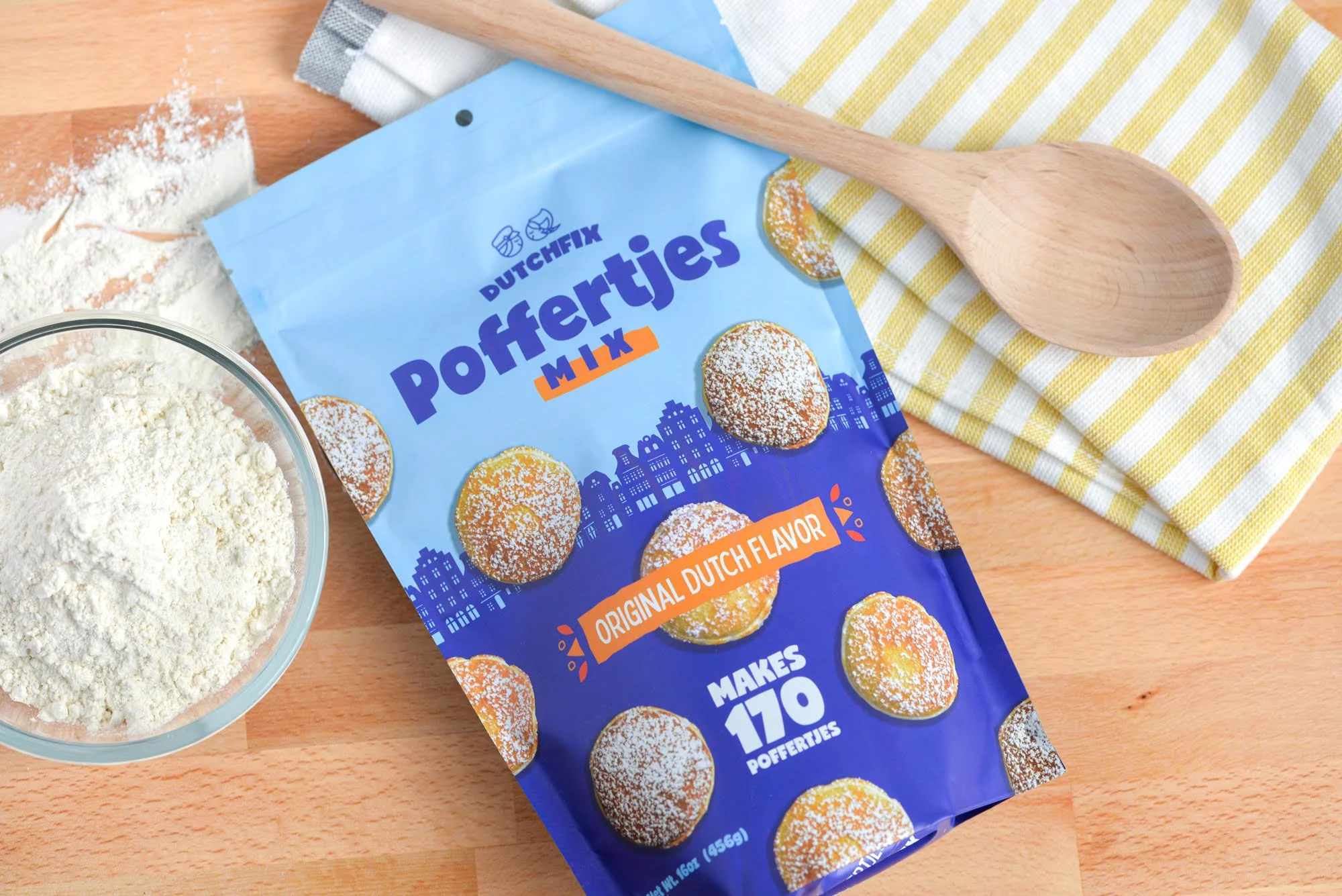
And we looked at the rest of that category and what it looks like. And we found that most of them had warm color. So lots of reds, browns, yellows. I don’t think there’s really an orange, but just general warm color tones. If we were making a pancake mix package design, we might have considered that we would want to kind of abide by that general color scheme. And when it comes to food, warm color tones are always a good fallback.
However, being that it was a product that we needed to do some educating, and it was a brand that’s unknown, we really wanted them to stand out. So we went in a completely opposite direction with a cool color scheme.
We went with some light blue and like a dark blueish, purple kind of color as the main colors on the packaging. So that made ’em stand out and not feel like they were also a pancake mix because it could be easily misunderstood as a pancake mix. The other thing that we did was we looked at imagery on the packaging.
In most cases, in that category, your pancakes were shot from either a 45 degree angle view or a side view of a stack of pancakes. And it’s visually interesting and makes sense for them. However, for us, this product is much smaller. We had to do this educating to show them that this wasn’t intended to be a six inch diameter pancake when you cook it.
So we showed the top view, with angles of the product life size, which is, like I said, about a half dollar, like two inch diameter circle. And from a top view. The way that we arranged it on the packaging was kind of more in a fun pattern rather than on a plate and next to a fork and on a breakfast setting or something.
That helped show the customer, hey, when you make this, you’re not gonna make five of them. You’re gonna make 30 of them. And then we also made sure on the packaging we showed in text, we said that this makes, I think it’s like 180 or 170, this makes 170 Poffertjes and it was pretty big.
Those are all things ways to use visuals to communicate. Without that text even, we just showed the product in a pattern that makes it look like there’s a lot of them and not that you’re going to eat two of them at a time, you’re gonna eat a lot of them.
Just doing that educating and coming back to the trends part and, and how we diverted from that category, needing to stand out and just educate the customer in general.
Anna:
That’s such a great example. I love that. Thanks for sharing it. Because it really shows that design choices aren’t just about finding something that looks pretty or something that looks cool or something that looks attractive.
It really goes back to your business strategy and figuring out, what people need to know about your product in order to buy it. And that’s gonna be different depending on what you’re selling and who you’re selling it. So, I love that. Thank you so much.
As we wrap up here, how can people get in touch with you?
Adam:
If you’re just looking for either design inspiration or you wanna see some of the work that we do, you can always go to aviditycreative.com. I would also recommend, because we’re been busy lately and haven’t been able to keep our website up to date like we would like, look at our Instagram, we try to post thing when we finish projects, it’s easier to post to Instagram quickly with some photos. And if you wanna email, my email is just Adam at aviditycreative.com.
I’m open to questions, I’m open to obviously if you have projects, but we do a pretty good job of just educating clients. If you have questions on how you should approach something, we’re pretty open to just providing advice, probably at a lower cost than what we should… we don’t really charge for advice if someone has a question that wants to.
It’s been great doing this with you and, and hopefully we get to do it again in the future and I hope everyone out there learned a lot. I know I ramble, so hope you’re able to keep up.
Anna:
This has been great. Thank you so much Adam.
—-
Learn more at aviditycreative.com.
Sign up below so you’ll be the first to see our next Your Brand Editor interview!


Top 2025 Content Marketing Trends
This year, I’m seeing three big trends come to the forefront of content marketing.


