


What to Include in Your Website Footer

Your website footer is not a junk drawer.
Just as your top navigation bar helps visitors find what they’re looking for, the footer also helps direct them. And because people often refer to it when they’re a little lost, it becomes an important tool for preventing people from bouncing off of your site when they can’t find what they need.
So before we dive into real-life examples of great and not-so-great footers, here’s what to write in your footer:
1. Shipping Details
Shipping is one of the big question people have before the order online. It might seem like a minor detail, but if shipping details aren’t easy to find *before* checkout, you will lose customers. Your shipping information should be on your product detail pages, your contact page, your FAQ page, and in your footer. Sound like a lot? It is, but it’s necessary.
2. Return Policy
Return policies are another potential hang-up for potential customers. Especially first-time customers, and gift-buyers. So make your return and exchange policy easy to find in the footer.
3. Product FAQs
I can’t think of an ecommerce product that wouldn’t benefit from a good FAQ list. Writing your FAQ page deserves it’s own blog post, but for now, just make sure it’s linked in your footer.
4. Links to Your Main Pages
This might seem repetitive – after all, your main pages are in the header, so why include them in your footer too? The thing is, once someone’s scrolled all the way to the bottom of your site, it creates “work” for them to scroll back up and try to find what they want on your top nav. Including your main product category and business pages in your footer is one way to make your user experience as easy as possible. Links to include:
-
Your product category pages
-
Your About page
-
Your Store Locations or Store Finder pages
5. Contact Information
Not only should you link to your main contact page, but you should include at least one way for customers to contact you immediately. These include:
-
Your main email address
-
An office phone number
-
Live chat
6. An Email Opt-In
Get those email addresses! Your footer shouldn’t be the *only* place folks can sign up, but it’s a great place to keep a simple opt-in, ensuring that no matter what page visitors are on, there’s an opt-in nearby.
7. The Legalese
The boring stuff every ecommerce site needs… don’t leave out any of these elements!
-
Privacy Policy
-
Terms & Conditions
-
Updated copyright
Optional Elements to Round Out Your Footer
These aren’t strictly necessary, but can add value if done thoughtfully, in a way that doesn’t distract from your main footer elements.
Brand Story or Tagline
The footer can be a great place to add a taste of brand personality – the key is keeping it brief though. Remember your footer should serve potential customers who are lost.
SEO Oriented Copy
This is a favorite technique of a few famous marketing folks… and it’s true that the footer is a place you can build on your primary and secondary keywords. But. Adding a few keywords at the bottom of the page is not as impactful as having them in H1 at the top of your page, or in your meta tags. You cannot rely on this one paragraph to do heavy SEO lifting for you.
Brand Badges & Symbols
Use any badges your brand has, such as non-GMO Certification or B Corp Certification here, if they aren’t higher on the page also.
Don’t Let Poor Design Ruin Your Footer
Your footer is a customer service tool – not a creative canvas, and certainly not a junk drawer. Giving your footer a clean, neat design helps it serve it’s true purpose. There is a lot of information and links to put in the footer, so tossing them in haphazardly will create confusion – the opposite of a great user experience.
For best results, keep these guidelines in mind:
Use clear, sans serif font
Make use of columns to group information together, and add headings for even easier navigation. Examples of column headings would be “Shop”, “About,” and “Customer Service”.
Keep text left-aligned
Left-aligned text is the easiest to read!
Use clear, sans serif fonts
Your footer is not the place for a fun, scripty font – keep your text styles simple.
Make sure you use high contrast for readability
Light gray text on a medium gray background might look stylish, but it’s not great for readability.
Real Life Winning Footers
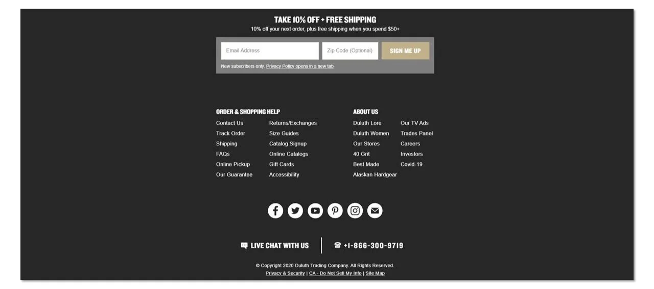
Your footer can be more than a narrow band – maximize the space to highlight information that’ll be helpful to shoppers. Duluth Trading Company makes it easy for people to sign up for emails, and get in touch via chat and phone.
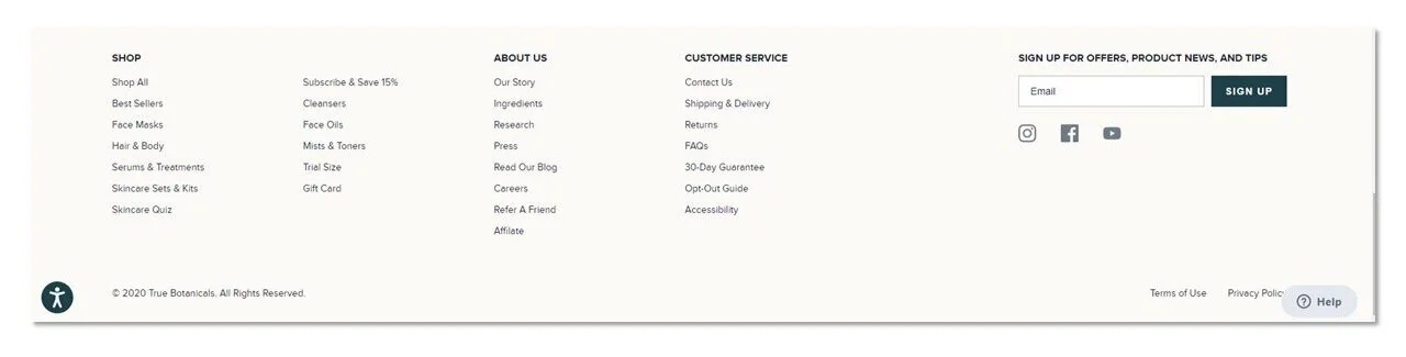
True Botanicals makes great use of column headings within the footer. This makes it so easy to find pertinent details!
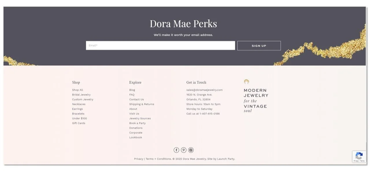
If you have a brick and mortar location, including your address and hours in the footer! And if you have a wholesale business, be sure to link to both information for retailers, and your store finder page for customers to easily figure out how to get their hands on your products! Dora Mae’s site has a great footer for a local business with an online shop. (Btw, this site was designed by Shelley at Launch Party – if you want a re-vamp for your Shopify site, check out her services!)
Room for Improvement
Now let’s look at some that could use a little sprucing up. Take a look at each screenshot and see if you can spot the problems.

This one from Green Girl Bakeshop has a couple issues:
-
A beautiful font that sacrifices readability.
-
No link to shipping, returns, or the store finder in the footer (not all sites have this, but Green Girl Bakeshop does).
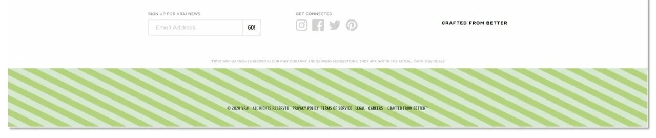
The one above is from Drink Vrai… and it breaks just about all our rules! I see at least 7 things that fail to meet best practices here.

Dr. Jart+ could have a great footer – the basic information is there, and the type is very readable…but all the options are all scrambled! Layout, layout, layout, folks! Columns are your friends!
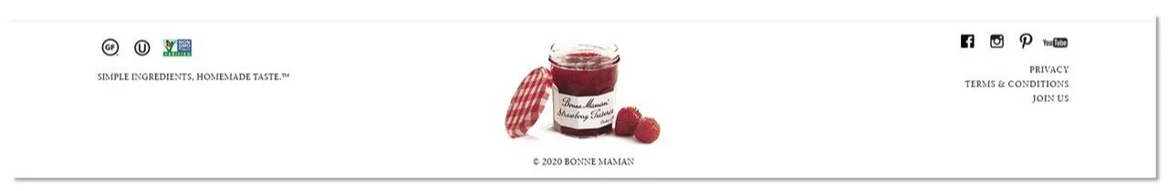
Bonne Maman keeps their footer simple and pretty, but their email opt-in is hiding under the “Join Us” label. Who knows how many subscribers (and therefore dollars), they’re giving up by hiding their email light under a footer bushel!
Okay, now that you’ve seen the most common mistakes, it’s time to evaluate your own site. Take a minute today and see what simple changes you can make to complete your footer. Then send me a note at anna@annakbradshaw.com with your before & after, so I can celebrate the small wins with you!


Top 2025 Content Marketing Trends
This year, I’m seeing three big trends come to the forefront of content marketing.


