Explore the Blog
Editorial Newsletters: Does Your Brand Actually Need One?
Popular reads
The Problem With Using AI For Content Writing in 2025
Recent Searches
Content Marketing, Copywriting, Email Marketing, Expert Interviews, Website Copywriting, eCommerce Marketing, B2B Marketing
Get the inside scoop on digital marketing for food and beauty brands
The 4 Basic Elements of Effective Ecommerce Product Descriptions
Updated October 2, 2020
Your product page is the last copy people see before they click “buy.”
Even if they’re onboard with your brand, and think they like what they saw in the thumbnail image, you can still lose people at this stage.
Ecommerce companies have conversion rates that range from less than 1%, up to 90%, with the overall median being 5% and the overall mean being 16.3%. [Source: Marketing Shera’s Ecommerce Marketing Chart]
With rates all over the board, optimizing your conversion rates are move about improving on your current numbers, than worrying about your competitors’ scores.
It’s up to you to figure out how to use your product images, copy, and overall design to get browsers to click “buy” instead of “back”.
Here’s an overview of the 4 essential elements effective ecommerce descriptions share in common:
1. An attention-catching opening line
Don’t start with a boring line about the fabric content, country of origin of the ceramic, or dimensions of a painting.
The opening line is your best chance to hook a browser and turn him or her into a customer.
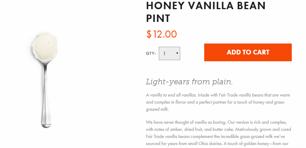
Jeni’s Honey Vanilla Bean copy gets started with an attention getting line that’s in a larger italicized font.
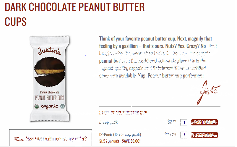
Justin’s Dark Chocolate Peanut Butter Cups copy gets you engaged from the get-go.
2. Outcomes-driven paragraph
If you’re selling toothpaste, you’re not just selling toothpaste.
You’re selling a confident smile that attracts instead of repels on first dates.
You’re selling the cost savings of expensive dental work 10 years from now.
You’re selling the ability to eat whatever foods you want, without fear of pain.
People want outcomes. They buy products to get those outcomes.
So don’t just sell the minty fresh flavor and the fluoride content. Sell the outcome.
Some companies skip all paragraph text and go straight into bullets on their product descriptions. This may work for your audience, or it may not. (Quick side note: don’t accept what articles on the internet say about your business – TEST everything for yourself. And if you want to partner on testing your product copy, send me a note).
However most companies find that opening their product descriptions with a brief paragraph or two allows for a more powerful product narrative.
When you’re writing this opening paragraph, keep in mind:
-
Length
If you need more space, break up your paragraph into a few short paragraphs. A lot of shoppers are in a hurry, and even if they’re not, they now they have thousands more options to browse if they’re not feeling your item. So write your copy for your true fans, and then make it accessible to skimmers.
-
Your brand voice
This is not the place to forget your brand voice and go all generic on your customers. The more you can weave your brand’s unique personality through your copy, the better.
Some companies truly excel at this, while others haven’t made it a priority.
Not every successful ecommerce company relies on brand personality. Zappos product descriptions are about as generic as they come. BUT you’re not Zappos, ok? Give yourself the best chance to succeed by writing punchy copy.
-
They call it romance copy for a reason
This paragraph-style text is often called romance copy in the industry because it helps build romance around your brand. Rather than focusing on facts and figures, this paragraph copy also focuses on feelings and emotion.
Always remember: for most brands, ecommerce is not just about price-matching and bulk discounts and free shipping. It’s also about customer experience.
People talk about creating an engaging brand story for their homepage, or their about page, or their Instagram captions, but people don’t usually bring this same story-telling into their product descriptions.
But this may be the very point at which inviting your customers into a story is the most important – they’re deciding whether to make your brand a part of their life or not. Instead of handing out roses, they’re handing out their credit card.

Gal Meets Glam keeps it’s feminine, retro-leaning personality intact with product copy for the Daisy dress .
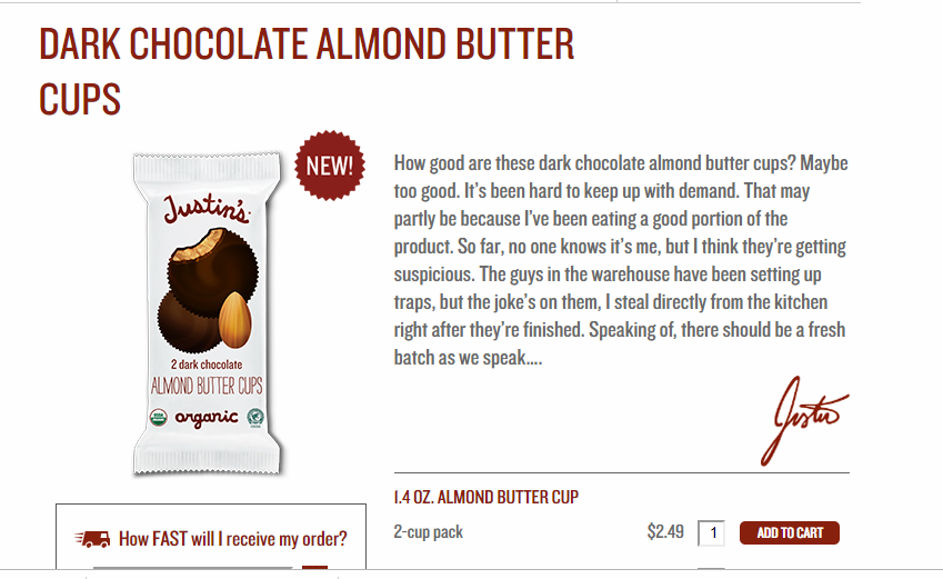
Justin’s product copy is all-personality, through and through.
3. Benefits-focused bullets
Using bullets allows shoppers in a hurry to quickly skim your page and get the critical info they need to make a decision.
A few months ago I was shopping for a throw blanket. Most throw blankets are somewhere around 40” x 50”, but I wanted a bigger one. So as I went from site to site, I was skimming descriptions for the dimensions. As soon as I saw the dimensions, I knew whether the blanket was a candidate or not, and if it had the right size, I went back to read more details about the texture, fiber content, etc.
Here’s an even bigger advantage you can claim over the competition: instead of just making your bullet points about the features and details of the product, make them about the benefits your product provides.
To use the toothpaste example:
Typical bullet:
-
Fresh minty flavor
Benefit-focused bullet:
-
Go into that meeting with your boss and hold your head high, knowing you’ve got minty fresh breath.
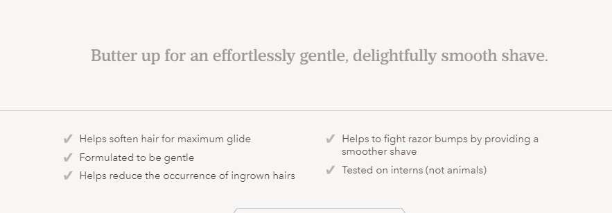
Dollar Shave Club keeps its copy for Easy Shave Butter benefit-oriented.

SmartyPants Vitamins copy for Adult Mineral Complete tells you exactly how it’s ingredients will help you.
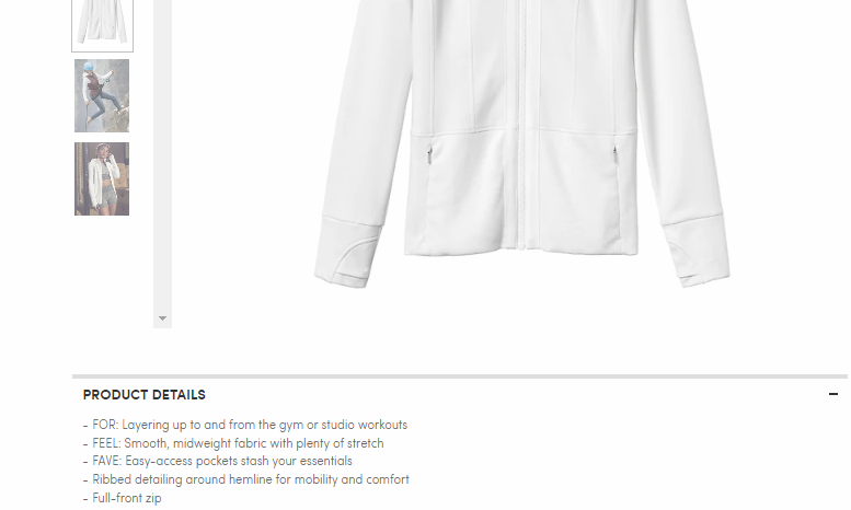
Athleta keeps their copy simple, but relevant, with clear, creative bullet points explaining what their Fitted Victory Jacket is good at.
4. All the relevant details
On my throw blanket quest, I immediately clicked out of any product pages that didn’t list the blanket’s dimensions. I knew if they didn’t list dimensions it was probably a standard size… of course I could have been wrong, but I didn’t have time to stick around and figure it out.
Don’t let your shoppers do the same – provide all the relevant details.
This is especially important for for functional items, like clothing. These days more and more clothing companies are sharing the model’s height and the size she’s wearing. Some are even including photos of multiple models in different sizes wearing the item.
These details serve shoppers well because one of the biggest hassles of online shopping is buying an item only to find out it looks totally different on you, or you’ve purchased the wrong size.
For clothing websites – don’t keep your sizing chart buried in it’s own page on your site – have it easily accessible from every product page.
Video is another way more online retailers are giving customers more information about items – whether it’s a model walking around in a dress, or a 360 view of a pair of shoes, or a rotatable-image of a sofa… all of these extra features give customers assurance that they really understand what the product will look like when it arrives.
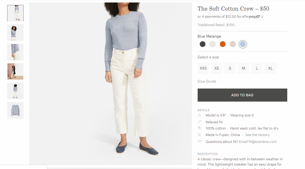
Everlane’s Soft Cotton Crew copy includes helpful details about fit and origin, along with photos that show the item from all angles.
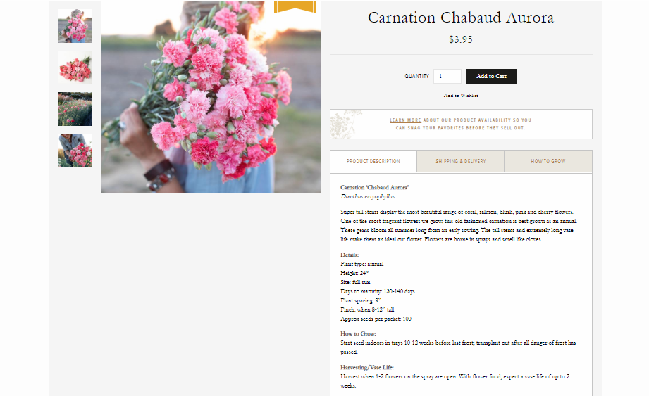
Floret Flowers gives all the details on their Carnation Chabaud Aurora seeds you’d find helpful if you’re planning a flower garden. (I’ve zoomed out here, but don’t worry – the copy is legible on their site)
When in doubt, test it out
As I alluded to earlier, all of this may be fine and dandy for 99.9% of businesses, but your audience may need a slightly different approach.
In fact, the most successful e-commerce companies test more frequently based on their own historic data, than less successful ecommerce companies, although almost all companies do some testing based on intuition (source: Marketing Sherpa’s Ecommerce Benchmark Study, available here).
Test your descriptions by changing one element at a time, and watching your conversion rates. Best practices are the best place to start, but there’s always room to grow.
If you’re interested in getting my eyes on your descriptions, or having me write your product descriptions, then click below to get in touch.
Top 2025 Content Marketing Trends
This year, I’m seeing three big trends come to the forefront of content marketing.
a must-read
Follow along on instagram
Not Ready to Work Together Quite Yet?
Stay in touch with the Your Brand Editor newsletter 📬
Anna Bradshaw is a copywriter and content strategist based outside Raleigh, North Carolina. She focuses on creating brand marketing campaigns, evergreen SEO content plans, and website copy that converts.
